If you're still trying to wrangle your newsletter's ad performance in a messy spreadsheet, you are not just creating headaches for yourself. You are actively losing money. A jumble of numbers confuses sponsors and costs you renewals. A dedicated newsletter ad reporting dashboard is what separates the pros from the amateurs, turning raw data into clear, compelling proof of your value.
Why Spreadsheets Are Holding Your Newsletter Back
Let's be real. Most of us started out using a spreadsheet. It seems easy enough at first. You just copy and paste a few key numbers, maybe add a simple formula, and shoot it over to your sponsor. But as your newsletter grows and you start juggling multiple sponsors, that simple process quickly becomes a tangled mess.
Keeping track of different campaigns, various ad slots, and manually entering data across endless rows is more than just a chore. It's a huge risk. One tiny typo or a broken formula can completely erode a sponsor's trust. This is where you cross the line from a professional media partner to someone just winging it. If you want to dig deeper, it’s worth understanding why traditional spreadsheets fall short when things get serious.
The True Cost of Manual Reporting
The fallout from clunky spreadsheet reporting isn't just about frustration. It hits your wallet. When sponsors get confusing or inconsistent reports, they can't see the value they're getting. If they can't see the ROI, they will not renew. Simple as that.
You end up spending your precious time fixing mistakes and triple-checking numbers instead of building relationships or, you know, actually writing your newsletter. This manual chaos also puts a hard ceiling on your growth. Imagine managing ten sponsors a month this way. Now picture twenty. The whole system just falls apart. At that point, you would need a dedicated system like a newsletter sponsor CRM just to keep your head above water.
Think of it this way: a spreadsheet is a passive box of numbers. It just sits there. A dashboard, on the other hand, is an active storytelling tool that brings your campaign's success to life.
A Booming Market Demands Professional Tools
The newsletter space is exploding. Sponsors have more options than ever, and they expect a certain level of professionalism. For a real-world example, look at a publisher on beehiiv who scaled from 0 to over 100,000 subscribers and generated more than $300,000 in revenue. A significant portion of that success came from professionalizing their ad operations, which includes clear, data-driven reporting. Sponsors see those kinds of results and want to work with publishers who operate at that level.
With so much competition, sponsors are used to seeing clean, intuitive dashboards from every other ad channel they use. When you send them a clunky spreadsheet, you immediately look less credible. It's time to ditch the old-school methods and step up your game.
Tracking the Metrics Sponsors Actually Care About
Let's be honest. Your sponsors care about one thing above all else which is results. To build lasting relationships and lock in those renewals, you need to speak their language. That language is all about performance data, not just fluffy vanity metrics.
Moving beyond a simple subscriber count is the first, most crucial step. It’s time to build a professional newsletter ad reporting dashboard that proves the real value you deliver.
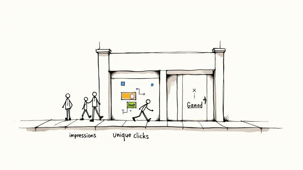
Think of it this way. Your total subscriber list is like the number of people who live in a city. It’s a big, impressive number, but it doesn't tell a sponsor how many people actually walked past their specific billboard. Sponsors need to know who saw the ad and, more importantly, who acted on it.
Core Metrics Every Dashboard Needs
So, what numbers really matter? These are not just data points. They are the ingredients you'll use to tell a compelling story about a campaign's success. Your dashboard absolutely must feature these core metrics.
-
Impressions (or Unique Opens): This tells you how many individual subscribers actually opened your email. Forget total sends. This is the true size of the audience that laid eyes on the sponsor's ad. To get a better feel for this, you can learn more about what a good email open rate looks like.
-
Unique Clicks: This one is simple but powerful. It counts how many individual people clicked the sponsor's link. This is your clearest measure of genuine interest and shows exactly how many readers were motivated to take the next step.
-
Click-Through Rate (CTR): Calculated as (Unique Clicks ÷ Unique Opens) x 100, the CTR is the percentage of readers who not only saw the ad but also clicked it. It’s a vital sign of how well the ad creative and your audience meshed.
Together, these metrics build a powerful narrative. Impressions establish the reach, clicks demonstrate genuine interest, and CTR proves the quality of that engagement. This is the kind of data that makes sponsors feel good about their investment.
Below is a quick breakdown of these essential metrics and why they're so important to your advertising partners.
Key Newsletter Ad Metrics Explained
| Metric | What It Measures | Why It Matters for Sponsors |
|---|---|---|
| Impressions (Unique Opens) | The number of individual subscribers who opened the email. | Shows the ad's actual reach and how many people were exposed to their brand. |
| Unique Clicks | The number of individual subscribers who clicked the ad's link. | Measures direct engagement and audience interest in the sponsor's offer. |
| Click-Through Rate (CTR) | The percentage of openers who clicked the ad link. | Indicates how well the ad resonated and the quality of the audience engagement. |
Having these numbers front and center in your reports immediately shows sponsors you understand what drives their business.
Why Context Is Everything
Just dropping numbers into a report isn't enough. You have to provide context to make them meaningful. Is a 2.5% CTR good? Bad? Average? Without a benchmark, it's just a number floating in space.
A sponsor might see a 3% CTR and feel underwhelmed. Then you explain that it’s double the industry average for their niche. Context turns good data into great results.
For example, Mailchimp's research shows the average email marketing CTR across all industries is 2.91%. However, this varies widely by niche. The "Hobbies" category averages a 5.01% CTR, while "E-commerce" is lower at 2.14%. Knowing these benchmarks helps you frame your performance accurately. Highlighting this manages expectations and, more often than not, showcases just how well your newsletter performs.
This kind of precise tracking is possible because of the sheer scale of email. With global users projected to hit 4.6 billion, the data pool is massive and reliable. It’s not uncommon for well-targeted automated campaigns to see open rates over 42% and click rates above 5%. This just goes to show how powerful a focused newsletter ad can be.
Ultimately, your ad reporting dashboard is a communication tool. By focusing on impressions, clicks, and CTR, and wrapping them in helpful context, you transform raw data into a clear story of value that every sponsor can understand and appreciate.
How to Visualize Data for Maximum Impact
Raw numbers on a page are easy to ignore. A sharp visual that tells a story is what sponsors remember. The real magic of a great newsletter ad reporting dashboard is turning your data into something a sponsor can understand in seconds, not something they need a manual to decode.
Choosing the right chart for the job is your first step. Think of each chart type as a different tool in your toolbox. You would not use a hammer to cut wood, and you definitely should not use a pie chart to show growth over time.
- Line Charts: These are your go-to for showing trends. A simple line chart is perfect for illustrating how clicks grew over the life of a campaign, making it easy to see performance momentum at a glance.
- Bar Charts: Need to compare things? Bar charts are your best friend. A clean bar chart can instantly show which of two ads performed better or how this month's results stack up against last month's.
- Number Cards: When a single metric is the hero, put it front and center. Use big, bold number cards to highlight the most important results, like total unique clicks or the final CTR.
Designing an Intuitive Dashboard Layout
Once you have picked your charts, the layout is what ties everything together. A cluttered dashboard is just as bad as a messy spreadsheet because it creates more questions than it answers. Your design needs to be clean, guiding the viewer’s eye directly to the most important insights without any confusion. To make sure your reports land with clarity and impact, it's always a good idea to follow established data visualization best practices.
An effective layout creates a clear visual hierarchy. Put your most critical, top-line metrics like unique clicks and CTR right at the top in those big number cards. Below that, use your line or bar charts to add context and show performance trends over time. This structure gives sponsors the "what" first, then the "how" and "why."
A great dashboard tells a story in layers. The headline numbers grab attention, the charts provide the plot, and the details offer the conclusion. It should feel like a guided tour of success.
Creating Sponsor and Internal Views
Not everyone needs to see the same data. One of the smartest things you can do is create two different versions of your dashboard.
First, you have the simple, sponsor-facing view. This version is all about the big wins and the most important metrics. Think of it as the executive summary. It is clean, concise, and focused entirely on proving ROI. It might only show core stats like impressions, clicks, and CTR. For some great layout ideas, check out this calendar view for newsletter ads example.
Second, you have a more detailed internal view for your own team. This is where you can dig into the weeds with data like click distribution over the first 24 hours, audience segmentation, or historical performance comparisons. This is your command center for optimizing future campaigns and spotting trends that help you sell smarter.
Building Your First Dashboard Step-by-Step
Ready to build a professional newsletter ad reporting dashboard? The good news is you don’t need to buy any fancy or expensive software to do it. We’re going to walk through the entire process using two powerful, and free, tools that most people already have: Google Sheets and Looker Studio.
This whole process is about turning your raw campaign data into a polished, automated report that will seriously impress your sponsors. You’ll go from staring at messy data exports to presenting a clean, visual story of success.
It's a simple, three-step journey from raw numbers to real impact.
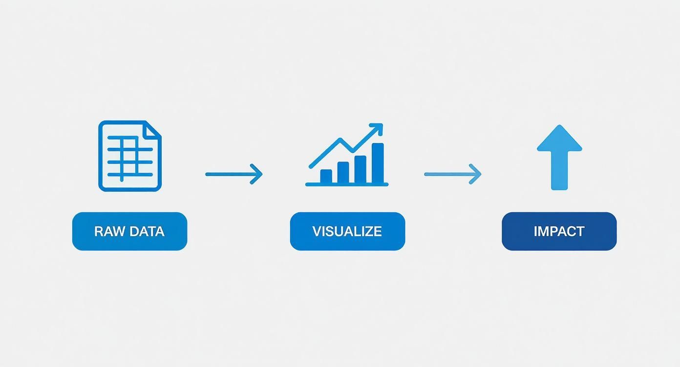
Think of it like this. You start with the basic ingredients (your data), turn them into something beautiful (the visualizations), and end up with a clear picture of your campaign's performance.
Step 1: Export and Clean Your Data
First things first, you need the raw numbers. Head over to your email service provider, whether it's beehiiv, Substack, or ConvertKit, and export the campaign report for the specific newsletter issue you're analyzing.
You’ll usually get a CSV file, which might look a bit intimidating with columns like Email Address, Open Date, and a bunch of other stuff. Do not worry about the clutter. We only need a few key pieces of information.
Now, open up a new Google Sheet and get organized:
- Import Your Data: Go to
File > Importand upload the CSV file you just downloaded. - Isolate Key Metrics: The only thing that matters right now is who opened and who clicked. Feel free to delete all the other columns to keep things simple.
- Create a Summary Tab: Add a new tab at the bottom of your sheet. This is where you'll do your calculations, keeping your raw data untouched and safe on the first tab.
This clean summary sheet is about to become the single source of truth for your entire dashboard.
Step 2: Calculate Your Metrics in Google Sheets
Time to crunch some numbers. In your new summary tab, we'll set things up so Looker Studio can easily read and visualize the data. It’s all about simple formulas.
Set up a few columns for each campaign or sponsor. Then, use these handy formulas to get your core metrics:
- Unique Opens: Use the
=COUNTUNIQUE()formula on your raw data's "opens" column. This ensures you're only counting each person who opened the email once, even if they opened it multiple times. - Unique Clicks: Do the exact same thing for the "clicks" column with
=COUNTUNIQUE(). - CTR: This one's easy. Just use the formula
=(Unique Clicks / Unique Opens). Do not forget to format the cell as a percentage so it looks right.
Think of this step as building a solid foundation. By creating a clean, organized data source in Google Sheets, you're making sure your final report in Looker Studio is not only accurate but also incredibly easy to update down the line.
Step 3: Connect Your Sheet to Looker Studio
With your data prepped and ready, it's time for the fun part. Looker Studio (which used to be called Google Data Studio) is a free tool that connects directly to your Google Sheet and turns those plain numbers into slick, interactive visuals.
All you have to do is connect your Google Sheet as a new data source. From there, it's a drag-and-drop experience.
You can add "scorecard" charts for your main metrics like opens and clicks, pop in a bar chart to compare different campaigns, and even change the colors to match your newsletter's branding.
The real magic is that whenever you add new data to your Google Sheet, the Looker Studio dashboard updates automatically. This means you can give your sponsors a link to a live report that always shows the latest performance.
Presenting Reports That Secure Renewals
Having a slick newsletter ad reporting dashboard is a great start, but it’s only half the battle. The real magic happens when you use that data to tell a story that makes sponsors eager to sign up again. Just sending over a link to the dashboard and hoping for the best will not cut it. You have to frame the results as an undeniable win.
Think of your presentation as a guided tour, not a data dump. Kick things off with a simple, punchy executive summary that puts the biggest wins front and center. This is your first and best chance to set a positive tone before your sponsor even lays eyes on a single chart.
From there, you can walk them through the key metrics. Your goal is to draw a straight line from the numbers on the screen to their actual business goals. So instead of just stating, "the campaign got 500 clicks," you should be explaining what that really means for their brand awareness and lead pipeline.
Crafting a Compelling Narrative
Every ad campaign tells a story, and you're the narrator. This means you need to go beyond just spitting out the standard metrics. The real value comes from adding context that shows the full picture of what you delivered.
Try structuring your report like a mini-presentation:
- The Executive Summary: Start with a few powerful sentences that nail the campaign's success. Something like, "Our campaign successfully drove 500 highly engaged readers to your landing page, which beat our click-through benchmark by 30%."
- A Deeper Dive into Key Metrics: This is where you pull up the main dashboard visuals for impressions, clicks, and CTR. Take a moment to explain what each number means for their specific goals.
- The Qualitative Wins: Here’s where you truly stand out. Did you get any glowing replies from readers about their ad or brand? Share them. This kind of authentic feedback is pure gold for sponsors.
This approach transforms a dry, forgettable report into a persuasive argument for another campaign. It shows you’re more than just a publisher. You are a strategic partner who’s genuinely invested in their growth.
A report is a record of what happened. A presentation is a vision for what can happen next. Frame your data to build excitement for a future partnership.
Handling Less-Than-Perfect Results
So, what happens when a metric does not quite hit the mark? Maybe the click-through rate was a little lower than you both hoped for. The key is not to panic or try to sweep it under the rug. Instead, use your data to find a different, more powerful story.
For instance, if the overall CTR was a bit soft, you could dive into your analytics and discover that a specific segment of your audience, say, readers in the tech industry, had an incredibly high engagement rate. You can then frame this as a valuable insight for the sponsor, showing them exactly which demographic their message connected with the most.
What could have been a negative suddenly becomes a strategic discovery for their next campaign. You could even use a newsletter ad ROI calculator to help them visualize the potential value from these highly engaged segments.
Personalization is a massive part of this. According to one report, a staggering 90% of newsletter creators are now tailoring their strategies based on subscriber demographics, because it's what sponsors expect. That same study from HubSpot also found that 46% of creators say newsletters generate ad revenue faster than other channels. This is a fantastic point to bring up when talking renewals. When you present data with this kind of detailed insight, you build undeniable proof of your value.
Answering Your Top Questions About Ad Reporting
Once you start treating your newsletter sponsorships like a real business, you'll inevitably run into the same questions that every other creator does. Getting these answers straight from the beginning will save you a world of pain and help you build rock-solid relationships with your advertisers.
Let's walk through some of the most common reporting questions. Nailing these details is what separates the pros from the amateurs, and it shows sponsors their investment is in good hands.
How Often Should I Be Updating and Sharing Reports?
For any campaign that's currently running, you should be peeking at your dashboard every day or two. It might sound like a lot, but this lets you catch problems like a broken link right away, not a week later when the damage is done.
After your newsletter goes out, the gold standard is to send a full performance report to your sponsor within 48 to 72 hours. This is a huge signal of professionalism and gives them fresh data to work with. For your own internal tracking, keep a master dashboard that you update monthly or quarterly. This is where you'll spot the bigger trends in your ad performance over time.
What’s the Difference Between Total and Unique Clicks?
This one is crucial. Getting it right shows sponsors you know your stuff.
- Total Clicks: This is the raw count of every single time a link was clicked. If one super-fan clicks an ad link 10 times, that’s 10 total clicks.
- Unique Clicks: This counts each person only once, no matter how many times they click. That same super-fan? They only count as one unique click.
Always report both numbers, but put the spotlight on unique clicks. This metric tells the sponsor how many individual people they actually reached. It’s the number they care about most because it reflects the true audience engagement.
Why Doesn't My Data Match My Sponsor's Data?
First off, do not panic. Data discrepancies are incredibly common and rarely mean something is broken. It usually just boils down to different systems tracking things in slightly different ways.
Your email service provider and your sponsor's analytics platform might define a "bot click" differently, or there could be a tiny delay in how each system registers the click. It happens.
The best way to avoid confusion is to get ahead of it. Before the campaign even starts, agree on a "single source of truth" with your sponsor. This could be a shared Bitly link or a specific URL with UTM parameters that both of you can monitor. When you agree on the measurement tool from the get-go, everyone is looking at the same data, and trust is built right into the process.
Are There Better Tools Than a Spreadsheet?
Spreadsheets are the perfect place to start, but they quickly become a bottleneck as your business grows. Eventually, you'll want tools that handle the heavy lifting for you.
Looker Studio (what used to be Google Data Studio) is an amazing and free tool that can turn your Google Sheets data into slick, interactive dashboards that update on their own. Many newsletter platforms like beehiiv or marketplaces like Paved also have great reporting tools built right in.
If you find yourself managing tons of sponsors across multiple publications, you might look into more powerful business intelligence tools like Tableau, but just be ready for a much bigger learning curve.
Ready to stop juggling spreadsheets and start managing your newsletter ads like a professional? Ad Slots automates everything from scheduling and invoicing to reporting, giving you back hours every week. Streamline your ad operations with Ad Slots today.